Turning complex pay gap analysis into a clearer path toward workplace fairness.
Client
Paygaps
Year
PayGaps
PayGaps helps organizations analyze, understand, and address compensation disparities across their workforce.
However, compliance and compensation analysis are inherently complex.
HR teams are often required to work with large amounts of organizational data, statistical information, and reporting requirements — making it difficult to move from identifying problems to taking meaningful action.
The challenge was not only presenting data.
It was creating an experience that helps HR professionals understand what the data means and what they should do next.
Scope of Work

The Challenge
Before the redesign, PayGaps provided valuable compliance information, but the experience created several usability challenges.
The platform exposed important data but often required users to interpret the information themselves.
Key challenges included:
Complex organizational structures were difficult to understand
Important compliance signals were buried inside dense tables
Users had to interpret statistical results without enough context
Reporting stages felt disconnected from each other
System terminology did not always match HR workflows
The result was an experience where users could access information, but understanding and acting on that information required significant effort.
Design Goals
The redesign focused on three core principles:
1. Unify the Compliance Journey
Create a connected experience that guides users from setup to analysis to reporting.
2. Progressive Disclosure
Present the right information at the right moment instead of overwhelming users with every available metric.
3. Embedded Interpretation
Transform complex compliance data into understandable insights and recommended actions.
Solution
I redesigned PayGaps from a reporting tool into a compliance decision-support platform.
The new experience helps HR teams move through a structured journey:
Understand → Analyze → Identify Issues → Take Action
Instead of simply showing pay gap statistics, the platform helps users understand:
What the data means
Why an issue exists
Which areas require attention
What actions should happen next
Key Design Decisions
1. Job Catalog Redesign
Building confidence before analysis.
The Job Catalog is the foundation of the entire compliance process.
Previously, users were presented with role information in a flat structure, making it difficult to understand organizational relationships.
The redesign introduced a clearer hierarchy:
Department → Role → Evaluation Details
This mirrors how HR teams naturally understand their organization.
Improved Role Organization
Roles are now grouped by department and job family, reducing cognitive load.
Users can quickly understand:
Which roles exist
Which roles are evaluated
Which areas require attention
Clear Compliance Status
Instead of unclear system states, statuses were redesigned around user understanding.
Examples:
Verified
Requires Evaluation
Review Required
This makes the next action immediately visible.

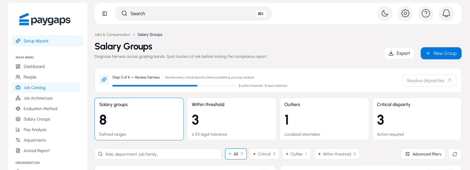
2. Salary Groups Redesign
Turning statistics into meaningful insights.
Salary analysis requires more than displaying numbers.
HR professionals need to understand:
Where risks exist
Why differences appear
What action should be taken
The redesign transformed salary groups into diagnostic workspaces.
Risk Visibility
Each salary group now communicates:
Group size
Pay gap status
Distribution health
Recommended next steps
Users can quickly identify areas requiring attention.
Human-Friendly Data Interpretation
Complex statistical outputs are paired with understandable explanations.
Instead of forcing HR teams to interpret raw numbers, the interface explains:
Whether the difference is significant
What may be contributing to the issue
What should happen next
3. Job Architecture Redesign
Helping organizations maintain structural consistency.
The Job Architecture view helps HR teams answer:
"Are equivalent roles positioned correctly across the organization?"
The redesign improved the experience by making structural issues easier to discover.
Guided Architecture Review
Instead of presenting a passive matrix, the interface highlights areas requiring review.
Users can identify:
Missing role assignments
Structural inconsistencies
Alignment opportunities
Improved Visual Hierarchy
Empty areas and irrelevant information were reduced visually, allowing important organizational patterns to stand out.

Handling Complex Compliance States
Privacy Protection
For situations where sample sizes are too small, the previous system state could create confusion.
The redesign introduced clearer communication:
Data Masked for Privacy Protection
Explaining that the information is hidden due to compliance requirements rather than a system problem.
Empty States
Instead of leaving users with blank screens, empty states guide meaningful actions:
Import Employee Data
Create Salary Groups
Assign Role Levels
No Risk States
When organizations meet compliance expectations, the platform communicates confidence:
Within Threshold
No action required. Ready for reporting.
High Risk States
When significant disparities exist, the platform moves beyond highlighting problems.
It helps users understand:
What caused the disparity
Which roles contributed
What corrective actions are possible

Outcome
The redesign transformed PayGaps from a complex compliance reporting system into a guided decision-making platform.
The improved experience enables HR teams to:
✓ Understand organizational structures faster
✓ Identify pay equity risks more clearly
✓ Interpret complex compliance data confidently
✓ Move from reporting to meaningful action
✓ Reduce the complexity of compensation analysis
Impact
PayGaps demonstrates how thoughtful enterprise UX can simplify highly complex workflows.
The redesign was not about removing complexity from compensation compliance — because the problem itself is complex.
The goal was to make that complexity understandable.
By combining structured workflows, progressive disclosure, and human-centered data visualization, PayGaps becomes a platform that helps organizations build fairer workplaces with greater confidence.


