Management made Simple
Client
BuildTracker
Year
2026
Designing a project management platform that reduces complexity instead of adding to it.
Project management tools are built to improve productivity, yet many become difficult to learn because of cluttered interfaces, overwhelming dashboards, and complex workflows. Teams often spend valuable time learning the software instead of getting work done.
Tracker was created with a different philosophy: software should adapt to people—not force people to adapt to software.
The goal of this project was to redesign the entire product experience into a modern, intuitive platform that helps teams manage projects, collaborate seamlessly, and complete work with confidence. Alongside a complete visual redesign, the experience was restructured to simplify navigation, reduce cognitive load, and make everyday actions feel obvious from the very first interaction.
Scope of Work

Understanding the real problem.
Having previously managed teams using tools like Monday.com, I had experienced the same frustration many users face. Instead of focusing on projects, new team members often needed onboarding sessions just to understand the software.
The challenge wasn't a lack of features—it was unnecessary complexity.
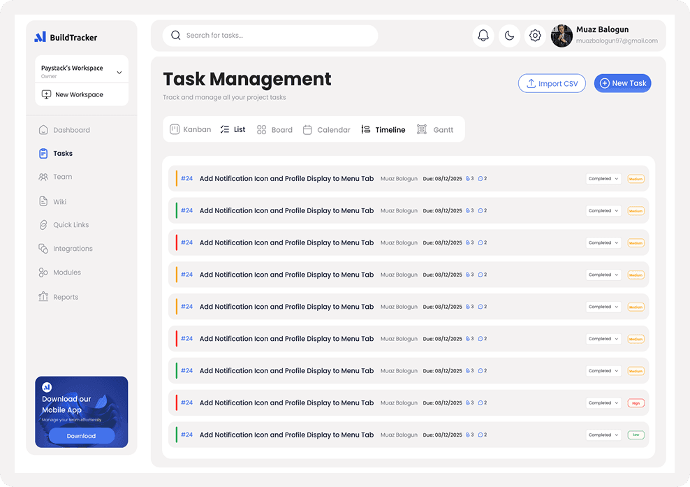
Before redesigning the interface, I focused on identifying the moments where users were forced to stop and think. Navigation, task management, status updates, and workspace organization were redesigned to feel more predictable, reducing the amount of effort required to complete everyday actions.
Understanding the real problem.
Having previously managed teams using tools like Monday.com, I had experienced the same frustration many users face. Instead of focusing on projects, new team members often needed onboarding sessions just to understand the software.
The challenge wasn't a lack of features—it was unnecessary complexity.
Before redesigning the interface, I focused on identifying the moments where users were forced to stop and think. Navigation, task management, status updates, and workspace organization were redesigned to feel more predictable, reducing the amount of effort required to complete everyday actions.


Designing for clarity before aesthetics.
A clean interface alone doesn't create a better product.
Every screen was designed around one guiding principle:
Reduce decisions. Increase clarity.
Visual hierarchy was simplified, actions became easier to discover, layouts became more consistent, and unnecessary interface noise was removed. The result was a product that feels approachable for first-time users while remaining powerful enough for growing teams.

Building a scalable design system.
Tracker wasn't designed as a collection of individual screens.
It was built as a scalable product system.
A reusable component library, consistent spacing system, typography scale, color tokens, and interaction patterns were created to ensure future features could be added without sacrificing consistency or usability. This significantly improves both the design workflow and developer implementation.

A complete product experience.
The project extended far beyond the application itself.
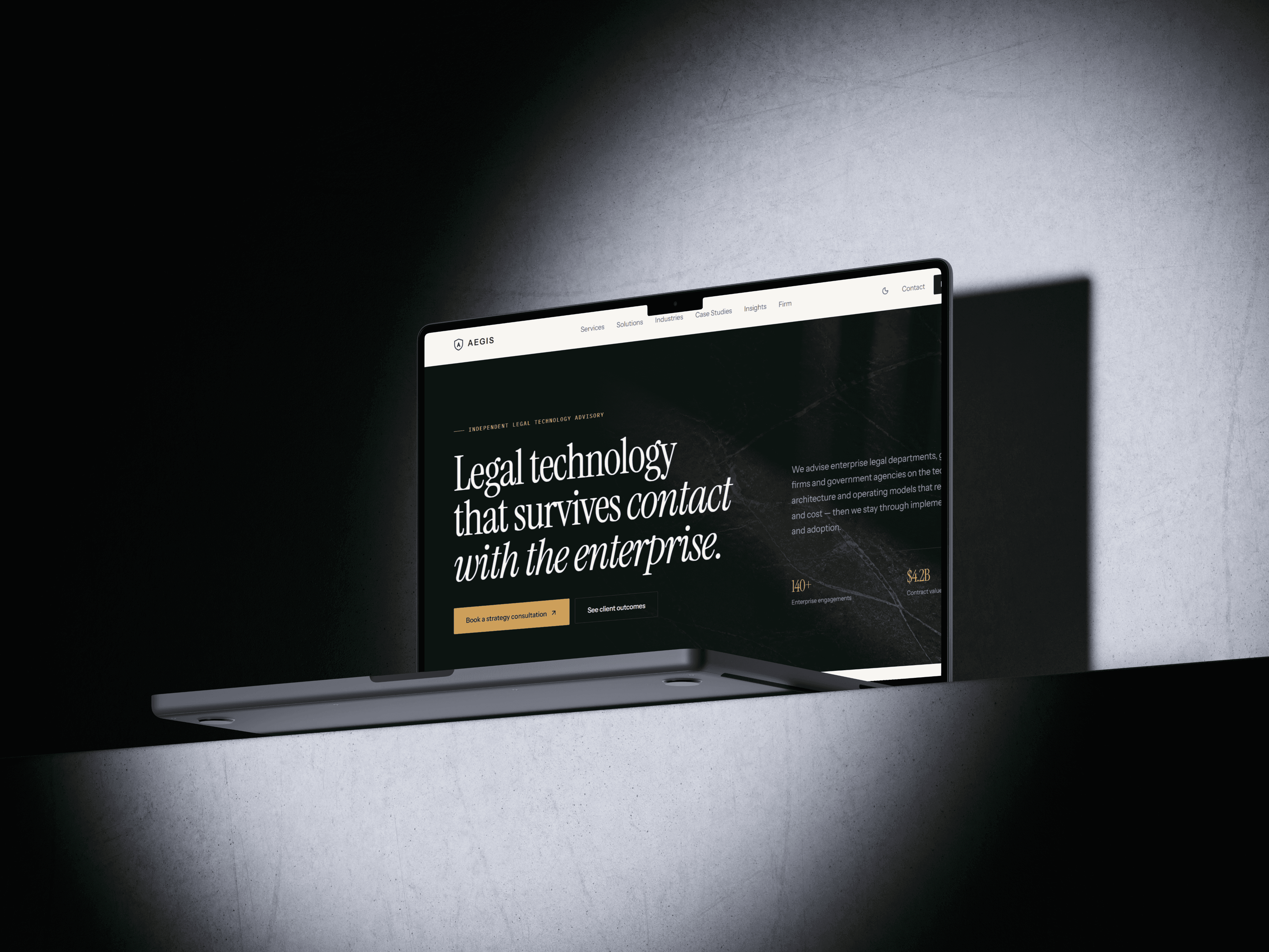
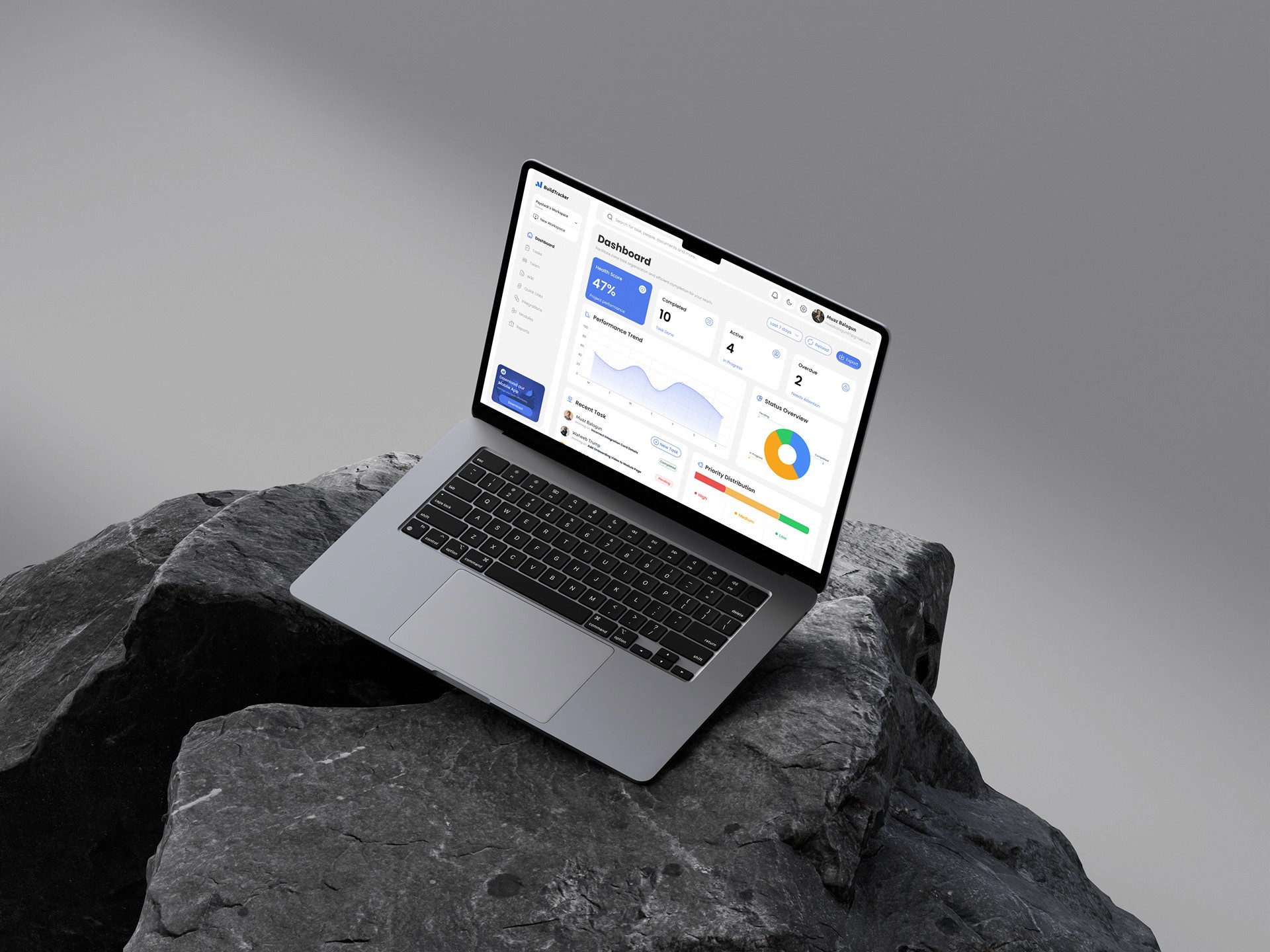
The work included the marketing website, onboarding experience, dashboard, project management workflows, pricing pages, authentication, settings, and supporting interfaces—creating a unified experience from the first website visit through daily product usage.
More than 60+ product screens were designed as part of the complete ecosystem.

Outcome
The product successfully delivered on its original vision of simplicity.
During product demonstrations and early feedback sessions, one theme repeatedly emerged without prompting: users consistently described the platform as simple, intuitive, and easy to use.
According to the founder, ease of use became one of the most frequently mentioned strengths of the product—validating the design objective of reducing complexity while maintaining powerful functionality.
With a complete product experience in place, the team was able to shift its attention from design decisions toward growth, marketing, and customer acquisition.